Diversity & Inclusion Rebrand
An integrated campaign bringing consistency and clarity to the firm’s internal and external D&I communications.
Tasked with leading a full rebrand for the Diversity & Inclusion department at Shearman & Sterling LLP, I created a unified visual identity that reflects the firm's commitment to inclusive design and corporate diversity initiatives. This project transformed outdated materials into a modern, strategic system used across internal communications.
Logo
The D&I department requested a refreshed visual identity that would reflect their core values of intersectionality, equity, and belonging. I developed a clean, modern logo that symbolizes unity—where diverse identities converge. Designed for versatility, this mark anchors all D&I collateral moving forward.
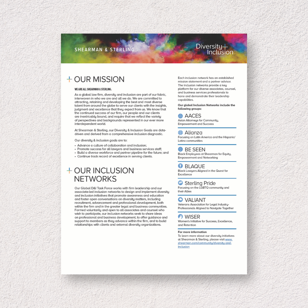
Handout
To support internal outreach, I designed a one-page handout that clearly communicates the department’s resources, purpose, and goals. The layout uses strong hierarchy and the firm’s brand palette to ensure readability and consistency across teams.

Newsletter - 2020 Year in Review
This interactive digital newsletter, built using Ceros, served as a year-end microsite to highlight the firm’s D&I milestones. Created for employees, clients, and external partners, the experience was responsive, shareable, and fully branded—an example of how digital design can drive connection and visibility.
Iconography
To unify the D&I visual language, I developed a custom set of icons reflecting key values and program areas. These icons maintain consistent stroke weight, color application, and thematic meaning—allowing them to be reused across print and digital touchpoints while reinforcing brand identity.